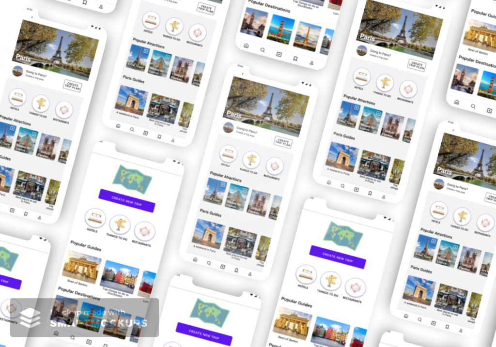
For this project, I was asked to design an app for a travel agency that would help travelers plan and organize their trips. The app would offer a range of features to assist with trip planning, such as recommendations for places to visit and activities to do. In addition, the app would provide users with access to discounts and special offers from app partners.
Our goal as UX designers was to create a solution that met the needs of travelers and helped the travel agency achieve its goal of increasing sales through recommendations and partnerships. To do this, we needed to understand the motivations and needs of the target audience and design a user experience that was both helpful and seamless.
Throughout the project, I worked closely with the client and conducted extensive user research to inform the design process. I developed personas, user flows, and prototypes to explore and test different design concepts. Finally, I conducted usability testing with the prototypes to ensure a high-quality user experience. Please note that this project was a study case and not developed into a fully functional app.
- Customer Segment: Travel Agency
- Customer Goal: Increase sales of packages, tourism attraction tickets, and hotels
Defining the problem and aligning expectations
We decided to begin the UX design project with a hypothesis statement in order to clarify the scope of the work, align the ideas and expectations of all stakeholders, and document the client’s understanding of the challenge.
- Defining the scope of the work involves identifying the specific problem or challenge that the project will address, as well as the goals and objectives that the project aims to achieve. A hypothesis statement can solve that by stating the assumptions and predictions that will guide the design process.
- Aligning ideas and expectations is important in any collaboration. A hypothesis statement can help ensure that all stakeholders have a shared understanding of the problem and the desired outcomes. By stating the assumptions and predictions that will guide the design process, we can ensure that everyone is working towards the same goals.
- Finally, documenting the client’s perceptions of the challenge is important for understanding their perspective and needs. A hypothesis statement can help to capture that clearly and concisely, providing a reference point for the design team as they work to develop solutions.
Hypothesis Statement
We believe that by helping travelers to smoothly plan and organize their trips (for free), we can increase our sales of tourist attractions as well as increase brand awareness. We will know we are successful when the app achieves positive ROI.
Matrix CSD
After formulating the hypothesis, we sought to understand the evidence and assumptions that supported the stakeholder’s premise. To do so, we asked the question:
“What leads you to believe that travelers need or want an app to plan and organize their trips?”
We compiled all the responses in the CSD Matrix, which helped us identify the evidence, assumptions, and questions we had about the user’s journey.
| Certainty | Suppositions | Doubts |
|---|---|---|
| Travelers use Excel to organize their trips, and they would appreciate a more elegant way to do it | How do travelers plan their trips? | |
| Travelers lose time to find important information in their e-mail (like flight numbers, tour tickets, and so on) | How do they organize all the information? | |
| Travelers want to visit as many places as possible, and they would appreciate optimizing tools that show them the best route effortlessly | Where do they store important information? | |
| Travelers would appreciate it if they could easily see their scheduled plan organized into a calendar | What do they plan ahead, and what do they plan on an ongoing basis? | |
| Travelers would like to have updated information about migration documents and requirements, including COVID-19 restrictions | Do they prefer to plan ahead or to decide things during the trip? | |
| How do they feel when planning the trip? | ||
| What are their pain points during the planning and traveling? | ||
| What is their biggest motivation to travel? |
Competitor’s Benchmark
Before conducting user research, we decided to perform a competitor’s benchmark to understand how our product idea compares to similar offerings in the market.
This is important because it allows us to identify opportunities for differentiation and understand the features and functionality that are most valued by users.
We chose to focus on direct competitors rather than conducting a more comprehensive analysis of indirect competitors, as we wanted to narrow our focus and get a deeper understanding of the products and services that our target users are most likely to be considering.
Direct competitors
| Feature | Wanderlog | TripIt | TripAdvisor |
|---|---|---|---|
| Easily add flight and hotel reservations | ✅ | ✅ | ❌ |
| Easily add activities | ✅ | ✅ | ✅ |
| Collaborate with friends in real-time | ✅ | ✅ | ✅ |
| Optimize your route automatically | ✅ | ✅ | ❌ |
| Organize activities in a calendar view | ✅ | ✅ | ✅ |
| Personalized activities suggestions | ✅ | ❌ | ✅ |
| Export your places to Google Maps | ✅ | ❌ | ❌ |
| Track travel expenses | ✅ | ❌ | ❌ |
| Split travel expenses with friends | ✅ | ❌ | ❌ |
| Converts to any currency | ✅ | ✅ | ❌ |
| Travel Guides and Reviews | ✅ | ❌ | ✅ |
| Offline access | ✅ | ❌ | ❌ |
| Upload documents | ✅ | ✅ | ❌ |
| Immigration Information | ❌ | ✅ | ❌ |
| COVID-19 Requirements | ❌ | ✅ | ❌ |
| Finds eligibility for flight compensation | ❌ | ✅ | ❌ |
| Tracks your reward programs | ❌ | ✅ | ❌ |
| Sends terminal and gate reminders | ❌ | ✅ | ❌ |
| Tells you to “Go Now” to the airport | ❌ | ✅ | ❌ |
Desk Research
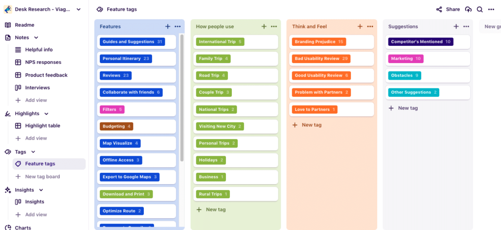
After completing the benchmarking of our competitors, I decided to continue my research with a desk analysis of the app store reviews for two of our three direct competitors.
I chose to exclude one of these competitors, TripIt, from this aspect of my research as their business model, which primarily relies on subscriptions for software premium features, is not in alignment with that of our client, which focuses on increasing sales of tourist attractions.
By focusing on these two competitors, whose models align more closely with our client, I gained a deeper understanding of the products and services that would likely appeal to our target users and aid our clients in increasing their sales.
I employed Dovetail, a software designed for data collection and analysis of customer feedback, to conduct a comprehensive analysis of 65 reviews. This process of gathering and categorizing the reviews enabled me to gain valuable insights into customer needs and preferences.
With this information, I reviewed and updated our CSD Matrix, as you can see beneath. Additionally, the analysis of customer feedback also gave us a glimpse into some of our doubts, which I attempt to answer below in a detailed and clear manner.
- How do travelers plan their trips? From the insights we gathered, we could see that many users like the suggestions features. They like to discover places to eat, activities to do, good hotels, and so on. Reviews also seem to be very important for many users, and they use this information to help them in their decision-making.
- How do they organize all the information? Through the reviews, we saw that some users keep the list of saved places as a personal guide. Some people also showed to use the itinerary feature. However, is important to note that this evaluation is made based on two different apps, with different functionalities and so on. That’s why I added the following question to the doubts column: If people have the option to organize itineraries, would they prefer that rather than a “simple” list of saved places? Even though many reviews show us that the list of saved places and itineraries is part of their organization process, this topic deserves further consideration to go into detail, which will be done in the next steps.
Updated CSD Matrix
| Certainty | Suppositions | Doubts |
|---|---|---|
| Suggestions (guides), itineraries, and reviews are the 3 features most appreciated by users | Travelers want to visit as many places as possible, and they would appreciate optimizing tools that show them the best route effortlessly | If people have the option to organize itineraries, would they prefer that rather than a “simple” list of saved places? |
| 1 in 10 users mentioned that they like to leave a review and feel that they are contributing to the community | Travelers would like to have updated information about migration documents and requirements, including COVID-19 restrictions | What are the most important filters? |
| 26% of people said they like reviews and use them in their decision making | What is their biggest motivation to travel? | |
| 47% of people said they like to discover new places through suggestions | Where do they store important information? | |
| Some users would like the option to download scripts offline and/or download them to print. Depending on the location, battery or connection are not as reliable. | What do they plan ahead, and what do they plan on an ongoing basis? | |
| Some users like the option to invite friends to collaborate on planning | Do they prefer to plan ahead or to decide things during the trip? | |
| some users mention that they used spreadsheets before getting to know travel planner apps | How do they feel when planning the trip? | |
| some users mentioned getting lost in emails, looking for important information, before getting to know trip-planning apps | What are their pain points during the planning and traveling? | |
| the application is used for various types of travel, from national to international, short or long trips | ||
| Some users demonstrated to appreciate the option to organize the activities in a day-by-day itinerary |
Empathy Map
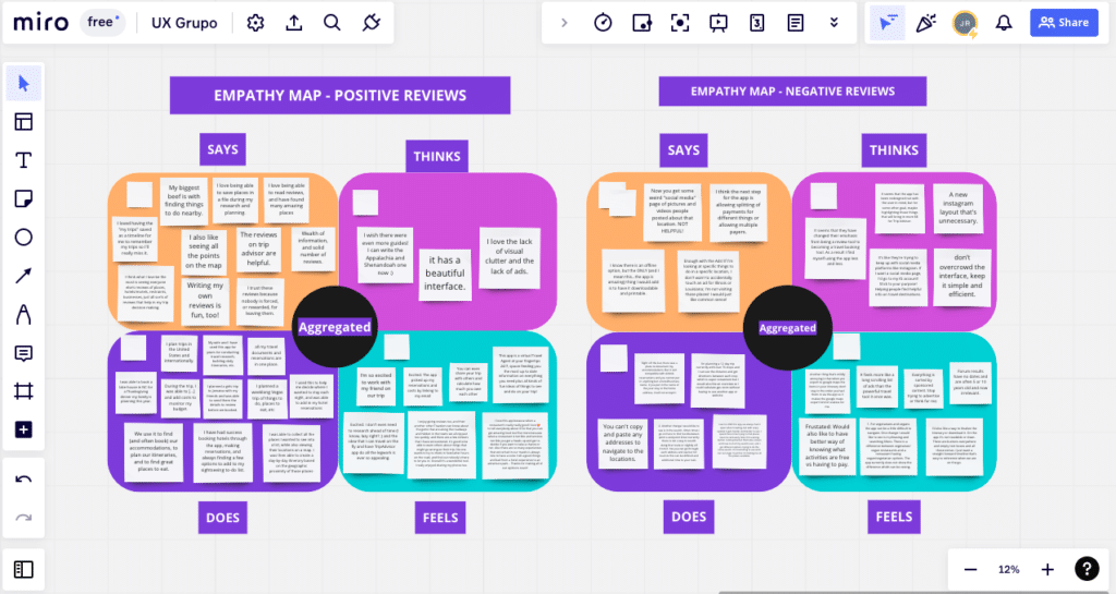
After analyzing 65 reviews from our direct competitors, we found the customer feedback to be highly informative.
Given the wealth of insights gained from the reviews, we decided to create an empathy map as a visual representation of what our potential customers value the most.
This visual representation will be an effective tool for engaging stakeholders, as it provides a clear and concise way to demonstrate how the user thinks and feels. In this way, we aim to ensure a cohesive and collaborative approach and drive product development forward in a customer-centric way.
Additionally, by reviewing user feedback and analyzing app store ratings, we were able to gain a clear understanding of the features that were most highly valued by our target audience, as you can see below. This information was used to create a preliminary roadmap for feature implementation, which will aid us in our efforts to optimize the user experience.
| Feature | Number of Mentions |
|---|---|
| Guides and Suggestions | 31 |
| Personal Itinerary | 23 |
| Reviews | 23 |
| Collaborate with Friends | 6 |
| Filters | 5 |
| Budgeting | 4 |
| Map Visualize | 4 |
In-depth Research: Planning
After a thorough examination of our competitors, it became clear that in-depth research and the creation of a user journey would be essential to the success of our product.
In-depth interviews are a crucial component of product development as they provide rich information about users’ needs, motivations, and behaviors. They also help us comprehend how users perceive the problem the product aims to solve and identify the context and factors that can affect their decision-making processes such as values, goals, and constraints.
Additionally, by creating a user journey, we will be able to identify any pain points or areas for improvement that may exist in our customers’ current experience.
With this in mind, we defined the objectives of our research and carefully crafted a research plan to achieve these goals.
- Research Objectives: The intended outcome of the survey is to provide answers to the following questions:
- How do travelers plan and organize their trips?
- How do they feel when planning/organizing their trip?
- What are their current pain points in this process?
- Research Questions and Participant Criteria: Traveled in the past 24 months
- Tell me about your most recent trips
- Why did you choose this destination?
- Once you choose the place, what do you normally do next?
- Do you normally plan activities ahead or do you decide while the travel is going on?
- Why?
- If planned: do you use any tool to organize this plan, such as paper or any online tool?
- On your last trip, how was the part of the documentation?
- Have you ever had any challenges in compiling the necessary documents for a trip?
- How did you feel about that?
- Is there any way in which you feel this challenge can be resolved?
- Is there any app you consider helpful or indispensable when traveling?
- Do you plan a budget for your trips?
- If yes: how does it go when keeping track of it?
- Do you normally go with cash or a card?
- Have you ever had any unexpected problems during a trip?
- If yes: Is there any way in which you feel this problem could be avoided?
- Is there anything you would like to share that I didn’t ask?
In-depth Research: Outcomes
.
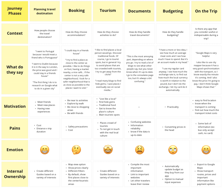
After conducting a qualitative research study that consisted of three in-depth customer interviews, we were able to achieve our research objectives and obtain a clear understanding of the questions we set out to answer.
This information was then used to create a user journey and customer personas, which provided a detailed representation of our target customer.
While a larger sample size and a more diverse set of personas would have been ideal, the insights gained from these interviews were sufficient to inform our product development efforts moving forward.
.
Personas
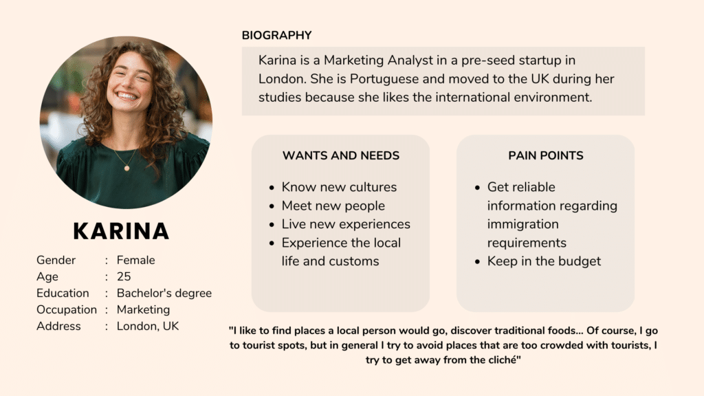
In order to create a more comprehensive sample of personas, we employed a combination of both desk research and in-depth interviews.
The desk research provided us with a broad understanding of our target market, while the in-depth interviews allowed us to gain a more nuanced understanding of the specific needs, preferences, and pain points of our intended audience.
By utilizing both of these methods, we were able to create a sample of personas that was both comprehensive and representative of our customer segment. This approach allowed us to have a more robust understanding of the end user, which will be invaluable in guiding our product development efforts moving forward.
.
Go-To-Market Strategy and Business Model Canvas
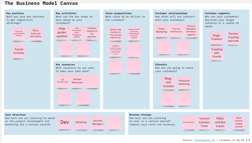
After completing our research process, we were able to gain a clearer understanding of our target customers and the value that our business could offer to them.
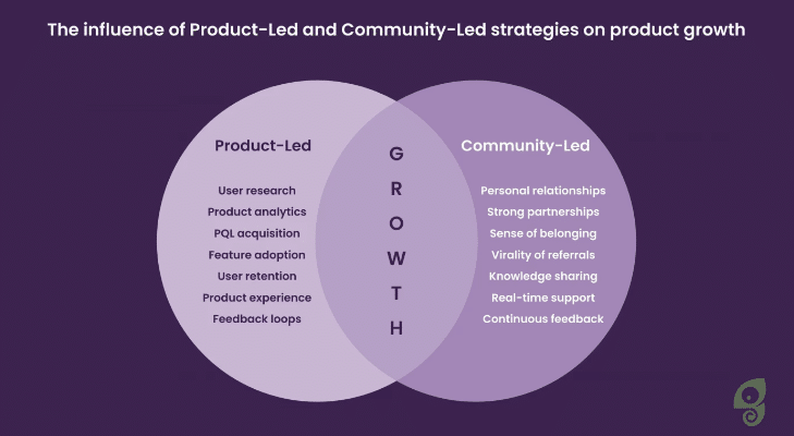
Consequently, we created a Business Model Canvas to illustrate the connection between customer needs and our business objectives. It also became evident that in order to be successful, we had to combine product-led growth and community-led growth strategies.
- Product-led growth involves focusing on the product itself and its features to generate leads and nurture customer relationships;
- While community-led growth focuses on leveraging connections with customers and prospects to create and grow brand affinity. By utilizing both strategies, we can further optimize our reach and effectiveness.
With the Product-Led Growth approach:
- Product analytics and metrics act as a driver for product adoption
- A positive user experience lays the foundation for the “aha!” moment(s)
- The reduced product friction intensifies the discovery of the real product value
- The unified work between product teams makes it easier to reach shared goals
- Continuous customer feedback loops insights back into the development process
- Satisfied users are happy to recommend your product to their network and community
With the Community-Led Growth approach:
- Word-of-mouth promotion helps you grow the community around your product
- The community itself magnifies your product visibility, recognition, and authority
- A sense of belonging strengthens the relationship between members and product teams
- The collaboration between community members reduces the number of support tickets
- The level of product knowledge expands with the variety of resources beyond help docs
- The feedback coming directly from the community influence further product development
From our vision, we identified three core deliverables that form the basis of our value proposition:
| Deliverable | Value Proposition | How it Works |
|---|---|---|
| Guides and Suggestions | Help travelers find the best gems and experiences at their destination | Guides can be created both by users and our team. Suggestions will be made by our algorithm, based on the client’s interest. E.g. if the user clicks more on guides about “activities with kids” than “best hiking trails”, we will show more options related to kids. |
| Reviews | Allow the community to participate and share their opinions and experiences | Both users and our team can register places and activities, such as restaurants, museums, trails, and so on. And all these places can receive reviews from the community. |
| Immigration Documents | We compiled everything, so the client doesn’t need to waste time with bureaucratic steps anymore | Our research showed us that compiling all the documents can be tricky and confusing. We aim to facilitate our user’s journey by giving them a list with the required documents, and links to official government websites. |
Roadmap
Before we proceed with our initial designs, we created a roadmap to identify which functionalities needed to be tested with users, and what should be prioritized.
| Round | Task |
|---|---|
| Round 1 | Create a new trip plan |
| Round 1 | Add activities to the trip plan |
| Round 2 | Visualize travel guides |
| Round 2 | Add activities direct from the guides |
| Round 3 | Visualize more information about each activity |
| Round 3 | See reviews from that activity |
| Round 3 | Add current activity to the trip plan |
| Later Rounds | Immigration Information page |
Currently in Progress
Currently, we are in the process of conducting user testing for our new product, alongside refining the Hi-Fi prototype. Our team is committed to delivering an exceptional user experience, and the insights gained from user testing will be valuable in ensuring that the final product meets the needs and expectations of its users.
Wireframes and Usability Test
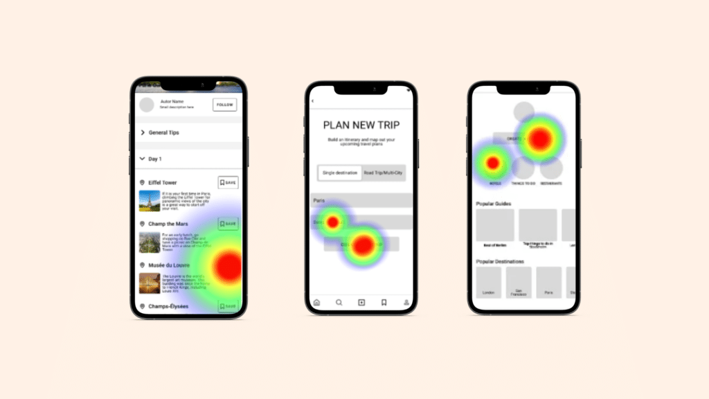
During the wireframing stage of our UX design process for a new travel app, we used low-fidelity prototypes to build more detailed representations of the app’s functionality and layout. These wireframes provided a better understanding of how the app would function and how users would interact with it.
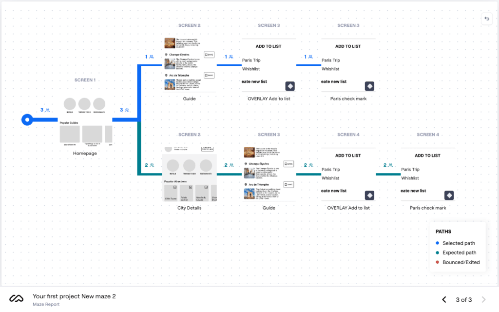
Usability testing was conducted at this stage to catch any potential issues early on in the design process, saving time and resources. We used Maze, a powerful testing platform that provided quantitative data and heatmaps to analyze the results and make data-driven decisions, optimizing user flow and interactions in our wireframes.
Access to quantitative data and visual representations of user behavior was critical in validating and iterating design decisions, leading to more user-centered and effective solutions. With the insights provided by Maze, we refined our wireframes, identified areas for improvement, and moved forward to the next stages of the design process with greater confidence.
In addition to the standard report generated by the platform, we also opted for live fixes for any errors we deemed crucial to the user’s journey. For this reason, we made multiple rounds with a small number of users.
This hands-on approach allowed us to quickly identify and address any major issues and ensure that the final product met the highest standards of usability and user experience.
.
High Fidelity Prototype
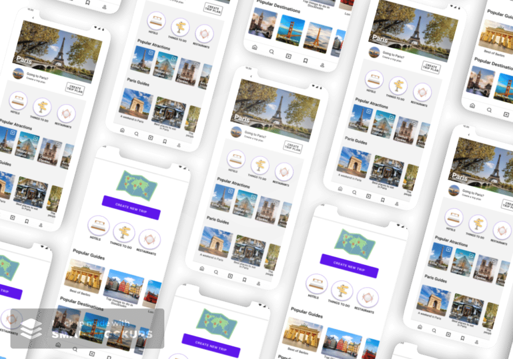
Our high-fidelity prototype is the result of a rigorous design process that involved extensive research, testing, and iteration. Based on the insights gathered from our low-fidelity prototypes, usability testing, and quantitative data analysis, we were able to identify areas for improvement and refine our designs to create a polished and intuitive user interface.
The final high-fidelity prototype reflects a cohesive design language that aligns with the app’s brand and user experience goals. Our design system provided a clear and consistent visual language that was applied across all screens and interactions, creating a seamless and cohesive experience for users.
The current prototype was the culmination of a process that involved several rounds of user testing, data analysis, and design iteration. Through the Maze platform, we were able to gather and analyze quantitative data, identify pain points, and make data-driven decisions that optimized user flow and interactions.
Overall, the final high-fidelity prototype is a testament to our commitment to creating user-centered design solutions that meet the needs and expectations of our users. By leveraging the insights gained from our research and testing phases, we were able to create an interface that is intuitive, visually appealing, and easy to use.